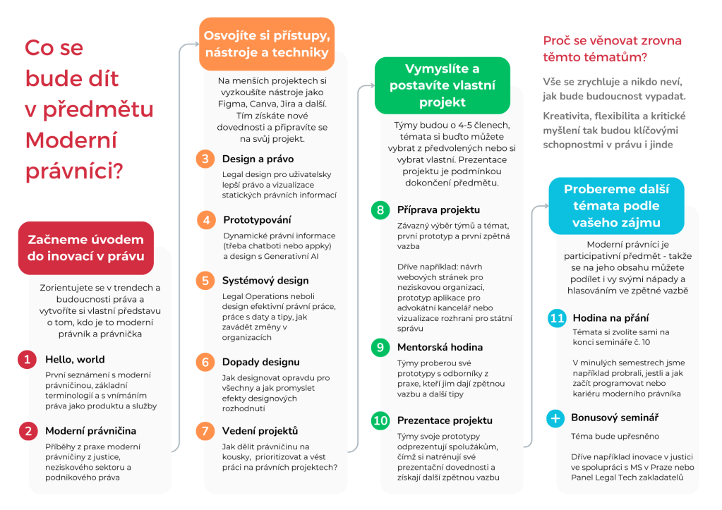
Students need – and deserve – to know the plan for their learning journey. A course map can be a valuable wayfinding tool – and more.
This article outlines the why and the process of preparing a course map for the class Modern Lawyers: Innovation, tech, and design that I have been teaching at Charles University in Prague since 2022. It is primarily focused on the making of the course map as a learning design tool, not on the substance of the class.
Why a course map?
Modern Lawyers is a participatory and data-driven class, so I collect a lot of data throughout each semester.
When I went through some of the student feedback, I concluded that I would get the most value out of creating much better class wayfinding. The ability to orient themselves in the course, and how things lead to one another, is absolutely essential for the students, and I get the best results when each class is very strongly tied to another. Without this orientation, the students don’t have the tools to develop their agency to drive their learning and things can feel a little random until later in the process. That means that there has to be something tangible and accessible to guide them through the semester.
So making a course map was my goal for the third iteration of the Modern Lawyers, with the challenge of how might we use a tangible artefact to inform the students about the key milestones and add to their learning.

The concept of a semester overview was nothing new – up until this redesign process, I was using maps that were informative, but of slightly abysmal visual qualities.


The process
First draft
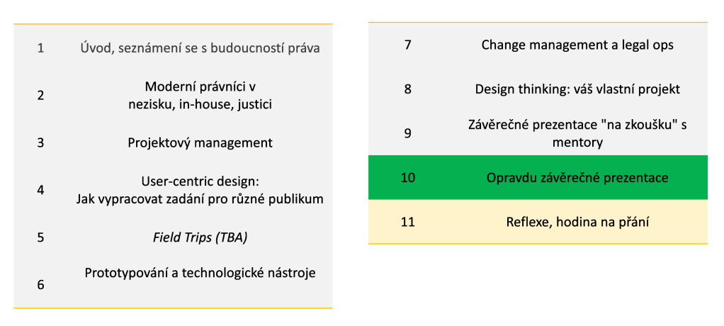
I took a look at the existing tools that I was using internally for the design of the classes: the five-minute schedule and a notion table, outlining the key aspects of each class (such as the key topic and the three main learning points). The classes are grouped by their position in the lifecycle of the class: introduction, tools, project, and reflection. These reminded me of traffic lights – ready, set, go! – so I assigned each segment a colour.
I wrote all this first on pen-and-paper and then into a simple map format that I was determined to test with my target group before I put any more energy into it.
User testing
One of my favorite bits of teaching the Modern Lawyers class is the codesign workshop. This is a completely voluntary exercise, students don’t get any credit units, or anything else out of it – but they do have a very real impact on the class and can experience the learning design process. This time, we held two: first a virtual one and then one in person with different students each time. Perfect space for prototype validation.
When I presented the prototype, I got back three key extremely helpful improvement points: be more specific, strip the jargon and the English (using Czenglish is a well-documented vice of mine AND there is no way how to call legal design in Czech), and include some examples of the final projects.
In the second session, the feedback was that the map needed to be streamlined. It inspired me to go back to the drawing board and make it way simpler and inject more narrative.

After the necessary adjustments, I sent it back to my co-designers. With their stamp of approval, the map was ready to be deployed live.
Going live
When I first used the course map in a live setting, I collected feedback twice: at the beginning and at the end of the first class. Just to get the first impression (pre-first class) and the stewed one. The first impression was slightly more positive than the second, but there were no specific comments.
I fully plan on discussing it further during the next codesign workshop, as this artefact is an essential and long-term calibration project.
With overall positive feedback, I gave it to the students to keep. I was also referring to the map at the beginning of each class, outlining the process of where we are heading and where we have been. I kept mine at me wherever I went.
What I took out of it
The course map turned out to be super helpful in my thinking as a teacher. By having to communicate the concept on a somewhat small real estate, I had to distill the essentials of each class. In turn, this has helped me to stay on course, when there were many concepts to explain within the class.
As mentioned, I don’t plan to stop here. I think the natural next step is that I want to use the colour coding of the classes more consistently throughout the course – I will probably use it in all the adjacent materials and tone each presentation to it (I’ll keep you posted). I also want to use the back side for the paper, so that the students can use it for their reflections, emotional map of the semester, and also to track their absences (which is otherwise a lot of admin on my side I’d like to eradicate).
I know that it is still a work in progress. I put work on my graphic design skills on top of my own learning objectives for 2024, and I already have a laundry list of improvements.
But overall, the process has been quite positive and I cannot recommend it enough, because it emphasises one key idea:
What am I really teaching in this class?
Baru

Leave a comment