
You are on an important call delivering a big pitch to your client. Your boss is there, too. You are in the flow and the client seems to be interested. You are about to deliver the final hook, when your partner suddenly opens the door because they need a charger they forgot in your home office. It completely throws you off, your partner can be seen in the background in their home attire, and you completely lose your train of thought.
Why this case study?
Home office is a very special work environment. If done right, it is all about getting things done and being productive and comfortable at the same time. But it is still a home office, the space you share with your family, where more than just work happens.
At the home office, there needs to be a intentional balance between productivity and human connections with the people you live with.
While we need to be mindful of our colleagues in all office settings, there are many challenges that are unique to home office, such as house layouts and loud appliances.
This case study documents my process of tackle digital communication in home office with a physical device controlled by a mobile app, which I internally refer to as CO-HOME.
I will review the research outputs, assumptions, principles, prototypes, and testing. You can use the buttons to skip to the respective part.
The process
Research outputs
I kicked off with five in-depth interviews with people who work in home office in parallel with their household members (such as partners, children, or roommates).
From these interviews as well as my own observations, I realized that there was a range of states from total focus to total attention. These are currently achieved by reading a lot of very nuanced signals, clear communication, and unfortunately the occasional snap at loved ones.
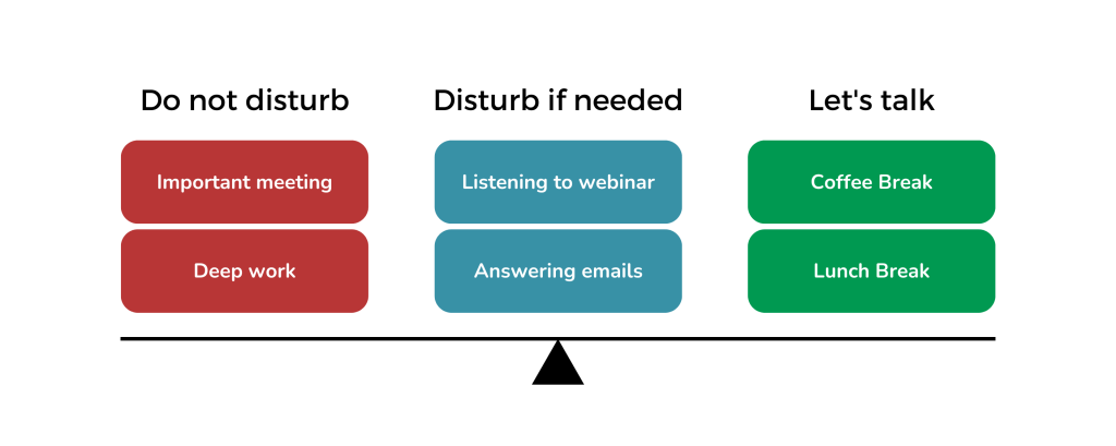
Based on this research, I identified the following key requirements that were broadly speaking common to all respondents:
- The users have the need to communicate a need for focus with the other members of their household
- The users have the need to interact with the other people, for example, when sharing meals or coordinating household operations
- The users need to have a way of notifying the other person when they need something
- The users need to be able to set their own messages specific to their household, for example regarding the use of loud kitchen appliances near their work stations
- Some users have predictable, repeated day structure, some do not, and there needs to be space for quick changes
Design brief
Based on the research outputs, I determined the design challenge and key principles and specifications for my solution:
How might we leverage digital communication tools to boost productivity while fostering gentle interactions among remotely working household members?
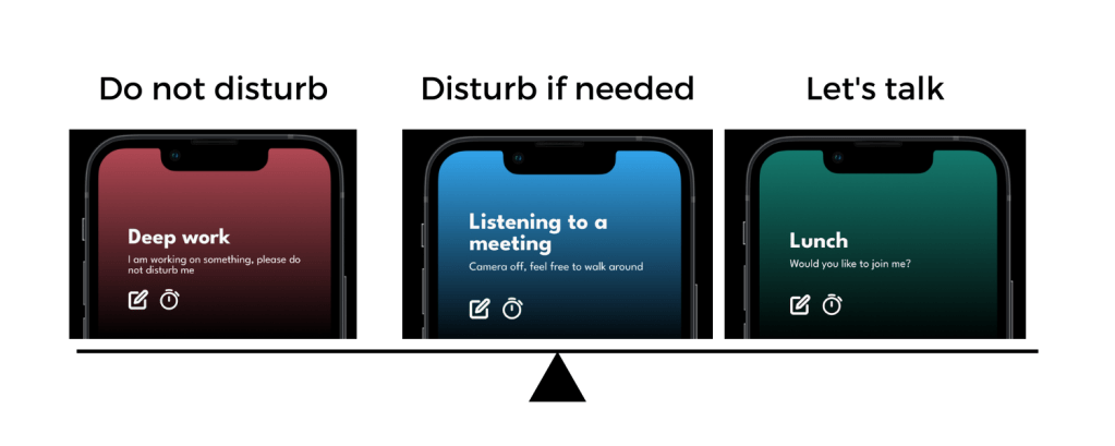
- Enhance, not replace human interaction: the device should help facilitate interactions that do not interfere with the work pace, but at the same time do not stifle the communication among the household members
- Gentle interactions: any rough notification or update could disturb the focus state
- No extra admin: this should not become another time-tracking device that would be a chore; the use should require minimal operation
- Visible Interface: there should be a very limited amount of screens and the user should not be asked to go too deep into the app
- Defaults: the app should come with the anticipated basics, which are easy to rewrite (both in general and in specific circumstances)
- Fitts’s Law: the amount of targets should be limited with each setting large enough to be very easy to hit with the least amount of taps
These were to be implemented in the following forms:
- Physical signaling device: many of the respondents do not check their phones while working or have children without access to phones
- Controlled by a mobile app: there is a limited ability to install things on work computers due to security regulations, household members can move around the house, in which case they usually have their phones with them and finally, an app enables reading and sending signals even outside of the household.
I wrote all these considerations and more into a design brief, and tracked everything in a Miro board.
Prototyping
Prototyping the states
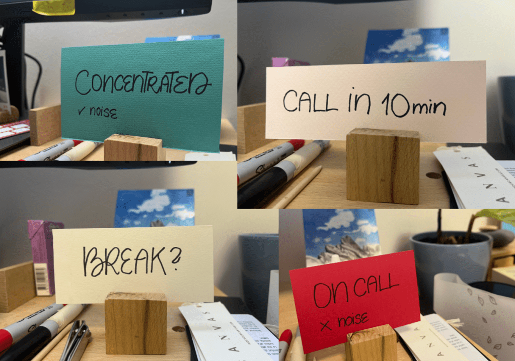
First step in making this app a reality was to see what could be the interactions of the physical prototype that the app would enable.
I prototyped this using different color cardboard cards with status messages. The goal was only preliminary feasibility testing, not necessarily a validation of the range of states.
First digital prototype
My second prototype was a series of sketches. I ideated a wide range of fun interactions, including different sliders, color coding, and different modalities. I used both rapid sketching of multiple interaction possibilities as well as a very slow process, where I randomly noted interactions in other apps and settings, and drew my own versions. At the end of this process, I had tens of pages of annotated sketches.
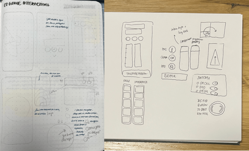
Upon reflecting on all the interactions, I concluded that in accordance with my no extra admin principle, a humble set of buttons would best reflect my design principles.
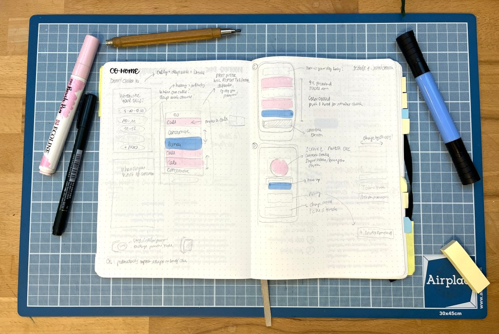
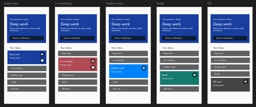
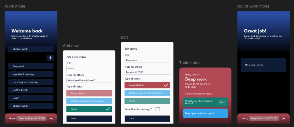
To test this, I turned the sketch into a figma prototype of the mobile app. The prototype included several pre-loaded status options (such as meetings, deep work, and break) that the users can customize or edit their own. The goal for this prototype was to see how the user could easily change their state by the app.
Mobile app user testing
I undertook moderated usability testing of the prototype with five respondents in two batches on two iterations.
During the iteration process, I incorporated the following key changes:
- removed the shallow work into the background, so it is a default, unless there is a focus state or a break
- added a first action default (which can be set by the user, usually shallow work such as checking emails)
- moved the partner’s status to the bottom into a separate screen, which makes it easier to navigate, gives space to a separate notification centre, and allows seamless addition of multiple work partners

All testers have complimented on how straightforward the app was and appreciated the anticipated needs and statuses.
Final prototype
After the testing, I added some UI elements, such as darker colors and additional functionalities using colors and icons. I also removed some of the labels to promote cleaner interface.
Subsequent versions of the app should incorporate the following:
- a calendar view and timer for specific states, which should allow the users to plan focus sessions on both a daily and recurring basis.
- the design of the notification centre
- onboarding process, which would be key in gauging the user’s needs
- more sophisticated off-work screen
The app could also come with a widget on the main screen of the phone, in iPhone standby mode for iOS users, or even for desktop.
You can click through the final version of the prototype here.
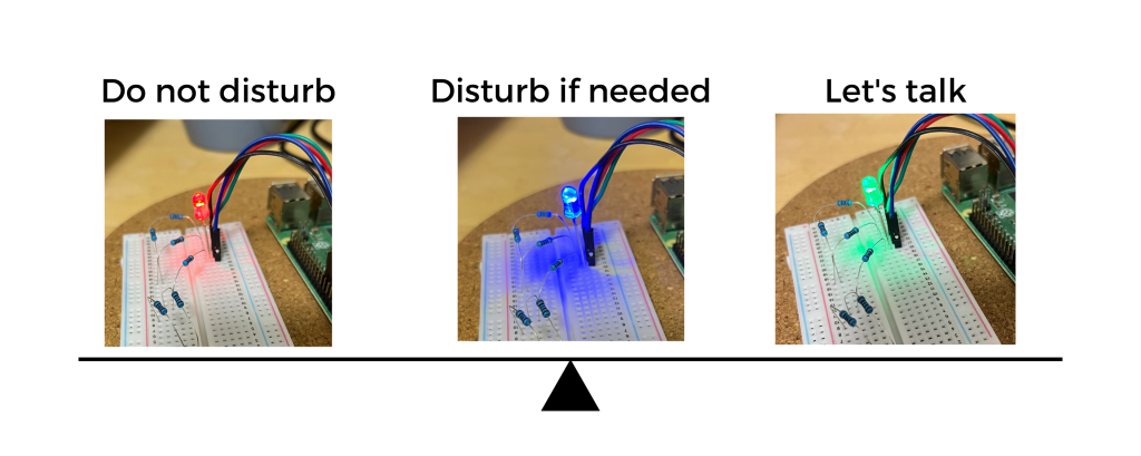
Experimental prototype using Raspberry Pi
Next, I wanted to prototype the physical device. For that, I used a Raspberry Pi and an RGB LED diode. I translated the color settings into a simple Python function and used SSH to control the Pi remotely using the terminal window.
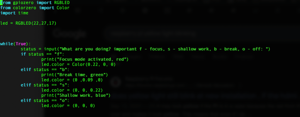
Here I only tested the focus states, not the notes. This gave me valuable feedback regarding the extent of the notifications and the meaning of specific colors. It was however only very limited testing, and the sole use of color would need to be further tweaked for accessibility reasons.
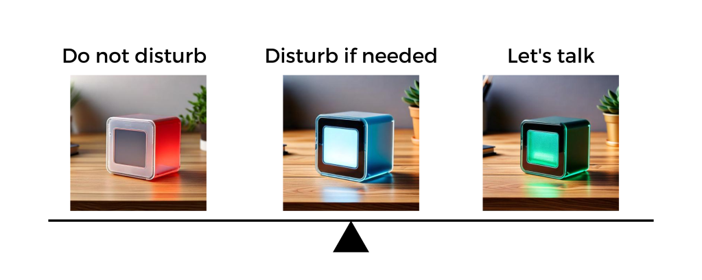
The next step would be to install a simple display and give the device a more aesthetically pleasing shape. I made a short ideation exercise using Adobe Firefly to visualize the general direction, enabling both a small ePaper display and color signals.
Reflection
I put a ton of work into this at nights, the holidays, and during weekends, making it a true passion project. Overall, I consider it to be a rewarding experience.
Above all else, I deeply enjoyed the multidisciplinary nature of the tasks, as I leveraged a very broad range of tools and skills:
- UX and UI (sketching, scripting, Figma, Coolors),
- project management (Miro, Notion),
- programming (Python),
- basic electrical engineering (setting up the LED, resistors, and GPIO connections on the Raspberry Pi),
- Generative AI (generating with Adobe Firefly, debugging using Claude and Perplexity, using ChatGPT to critique this case study).
I really appreciated that I did a very structured design process. I carefully reflected on each stage in the form of journal entries. This truly helped me not only to document the design process, but also distill actionable learnings.
Setting design principles for the whole project turned out to be a massive differentiator in terms of keeping me focused. It gave me a benchmark to measure each added feature or next step.
As a final side note: it was my first self-initiated Raspberry Pi project, and I had a blast outside of my software comfort zone.
The challenges
First of all, I have been working on my Figma design skills in parallel with this project. This meant that I was excited to put all my new knowledge into action, and I had to avoid going completely overboard with my first prototype. I ultimately had to simplify the wireframe for the purpose of testing anyway.
Secondly, I did a bootcamp on iOS apps and did my own zero waste shopping app as a part of my CS50 experience a few years ago. With the dev knowledge, I sometimes found using Figma limiting. I knew that this was part of the process and the nature of the tool, but sometimes my patience took a hit while trying to figure alignment of something that would take me literally one line of code in Swift. It was a struggle, but ultimately the right sequence of steps.
Finally, I was really nervous and self-conscious about showing a personal project to other people. It just felt very different from my regular work and I was worried that I will be taking things too personally. Thanks to this awareness, I used mindfulness exercises to prepare to have my precious prototype ripped into bits. I ended up having the best time during the testing and learned a lot.
What do you think about my prototype?
You set your CO-HOME status into “Very important meeting” and the device in the other room turns red. You are delivering a big pitch to your client. Your boss is there, too. You are in the flow and the client seems to be interested. You deliver your final hook, and the client is absolutely excited. When done with the call, you reach for CO-HOME and send a notification to your partner to come meet in the kitchen to have a celebratory coffee with you.
What do you think?
Could you use CO-HOME to enhance your homeofficing experience?

Leave a comment